Wednesday, October 10, 2012

You son of a migrant!

Over the course of the 20th century Australia experienced a remarkable increase in high school graduation rates.  This has been relatively stable for almost two decades at 74%, but is it evenly spread across the community?


One interesting variable impacting education attainment is immigration status.  It is not surprising that when designing an obstacle course for foreigners to jump through in order to be granted visas, the immigration department would include an education hoop.  As such, the fact that migrants have higher rates of high-school completion than the local variety is to be expected.


The extent of this effect is somewhat dependant on which corner of the globe the migrants arrive from, but all regions result in higher rates than those born in Australia*.


The data herein refers to people aged 20 to 29, to focus on the more current situation, while also reducing the impact of the change over time while also being mindful the rates have been stable since the mid 1990s.


* Regions grouped by the Standard Australian Classification of Countries( SACC)2011: http://abs.gov.au/ausstats/abs@.nsf/mf/1269.0

Interestingly, however, this effect endures beyond the first generation.  According to Census 2011 data, people born in Australia to two migrant parents are 18% more likely to complete high school than Australians with non-migrant parents.  Those with one migrant parent are 8% more likely (this appears to be the case regardless of whether the migrant is the mother or father).


Unfortunately the Census does not provide information beyond the previous generation, so we can’t (from this source) examine how long the migrancy influence is felt for.  

Come November, data on tertiary education will become available, allowing for much greater analysis of such topics. More to come.

___________
All data presented in this post was sourced from the Australian Bureau of Statistics' 2011 Census: http://abs.gov.au/websitedbs/censushome.nsf/home/Census?opendocument#from-banner=GT


Thursday, October 4, 2012

Sex education


Gender inequality, with regards to high school graduation rates, has not been this pronounced since pre WWII days.

According to Census 2011 data, boys born prior to 1959 were more likely to finish high school than girls, but the reverse has been the case from that year onwards.  The gap continued to increase for 20 years before steadying.  However, after a small bump in recent years the gap between the graduation rates mirrors the levels seen in the mid 1930s, with girls out-graduating boys by 10 percentage points*.

But let’s not get caught in the detail. The greater story is the educational revolution which has occurred over the past 80 years, in Australia and around the world.  While less than 20% of the community finished high school a mere 2 or 3 generations ago (less than 1 in 7 for girls), around 75% of today’s kids do so.   

Graph stops in 1992 as those born since have not had an equal opportunity to graduate yet.

Unfortunately, we seem to have plateaued. The fast growth in graduation experienced between those born in 1915 to those born in 1975 has come to a complete halt. The last 17 years have shown no significant movement, with those born in 1975 being just as likely to graduate as those born in the 90s.  Have we peaked? Or is this purely a revolutionary intermission?

And is 75% enough?

A similar halt to action occurred for boys born between 1955 and 1966, where for a period of over 10 years the rates of graduation did not improve.  That time, however, the effect was only felt by boys, while in the same period girls improved by 12 percentage points.  What was it about the 1970s that didn't encourage boys to improve their likelihood to graduate from school?  I have no idea, if anyone does, please let me know!

This story is not meant to suggest boys are hard done by, but rather to promote the overall improvements in access to education, in particular with regards to gender equality. To highlight one of the many improvements achieved in an impressive time frame  As well as to highlight that it was not so long ago that many of the things many take for granted nowadays were only afforded to a very privileged few.


* While girls’ graduation rates are currently 10% points higher than boys’, the same 10 points back in the 1930s (because of the small overall graduation rates) meant  boys were almost twice as likely to graduate as girls… oils ain't oils.

All data presented in this post was sourced from the Australian Bureau of Statistics' 2011 Census: http://abs.gov.au/websitedbs/censushome.nsf/home/Census?opendocument#from-banner=GT

Saturday, September 8, 2012

A Culinary Atlas

Not all cuisines are created equal.  Certainly not according to the Australia voting public at least.  

Following on from "Stirring the data with an urban spoon" (an analysis of urbanspoon data), this map compares popularity of different cuisines across the globe.


Culinary Atlas
Coloured by popularity
Dark Green = best, Dark Red = worst, Everything in between = everything in between
NB: Controversial borders do not reflect the views of the author, rather an attempt at standards.  Some questionable boundaries (Islas Malvinas/Falklands Islands, Cyprus) were represented in dual colours.

Some countries (Australia, China, United States) appear to have rubella. This is because their cuisines were described multiple times. Australia came under "Modern Australia" (in orange) and "Native Australia" (a slightly darker shade of orange).

Some countries' cuisines were individually defined (Thai, French, Moroccan, Brazilian), while others came under umbrella tags, such as "Africa" or "Latin America".  


Others were missing entirely from the list (eg. New Zealand, Sri Lanka, Russia, Sweden).


Faceboomers

After a recent spate of births and pregnancy announcements on my facebook feed, it seemed Australians were finally heeding the words “one for mum, one for dad, and one for the country” (Costello dixit).

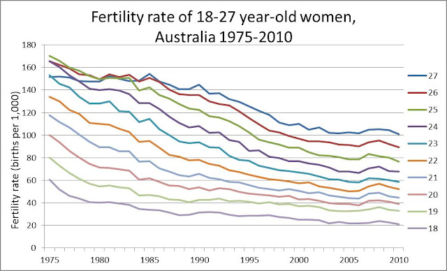
This should not surprise me as the majority of my friends are in their birth-giving prime (perhaps not biologically, but at least numerically). In fact, their age distribution closely mirrors Australia’s fertility rate curve1.


What is surprising is how far behind the national average my friends are. Only 29% of my female friends aged 30-342 have reproduced. This is less than half the national average for the same cohort (62%)3 . By my age, 47% of Australian women have had at least 2 kids! Whilst my facebook friends in their late 30s (35-39) do some catching up, they still fall way behind their national quota (63% vs. 79%). If I thought my world was being overran by babies, I can’t imagine what the average early-30s-Australian’s facebook page looks like!

I always thought my friends were special, and at least on this topic it seems to be the case, but I suspect the effect is mostly one of delayed production, rather than a total boycott. This will probably be exacerbated by the rapid growth in the fertility of over 35s.

While the rate falls away after 40, with less than 1% of women in Australia giving birth past 42 in 2010, the fertility rate of 35 year olds has doubled since 1989. Moreover, the rate for 40-year-olds has more than tripled in the same period.

I probably shouldn't be surprised when infants completely take over my feed in the coming years.

_________________________

The following three graphs are included in response to questions in the comments section. They are added for completeness.


______________________________
1: Births, Australia, 2010 - http://www.abs.gov.au/ausstats/abs@.nsf/mf/3301.0
2: Friends grouped in 5-year brackets (mostly for confidentiality reasons… and lack of exact age information)
3: Australian Census of Population and Housing, 2011. 

Wednesday, May 16, 2012

Stirring the data with an urban spoon


One of life’s great tragedies is the limited opportunity for meal consumption, usually estimated at 3 per day.  The seriousness of such a condition is accentuated when travelling through cities at fast pace.

Having failed to find an adequate pizzeria on the first of a two-day fly by Napoli, the alleged birthplace of such fine cuisine, the pressure mounted on my second day.  Without the three-meal-per-day phenomenon I could have tried every pizzeria I walked past, but knowing I would only get one crack at it, the choice would define my soon-to-be memories of this wonderful city.  The three-meal standard was once again proving a major limitation on my savouring life. 

After hours of walking, pizza napoletana.
I walked up and down the Neapolitan streets in search of this fabled slice, finally giving up as the sun was setting, mostly due to hunger, anger, and my train’s imminent departure.  In a final bout of desperation I succumbed to the type of ‘cheesy’ touristy pizzeria I would otherwise arrogantly lift my nostrils at.  Not even the world’s best table red (coca cola) could help me wash down the shame and disappointment.


Back in home territory the opportunities to try the local cuisines might not be so limited (numerically speaking), but the desire to maximise every outing still holds.  Over the years I have realised that a restaurant’s reputation is not a great predictor of satisfaction.  Neither is the size of its queue. But perhaps among the masses lie some nuggets of truth for us to take away. 


Websites such as urbanspoon provide peer reviews rather than the “hat” dispersing scriptures dividing good food from evil.  Usually used to check out restaurants individually, the data held by these online voting booths can surely tell us more about our candidates.


While not including every restaurant in Australia, the 22,297 profiled in capital cities across the country appear to constitute a majority of the population.  According to a quick search in the Yellow Pages there are 31,900 “Restaurant and Cafes” across the capital cities, and an ABS publication estimates the figure at 15,423 in 2007.  While the scopes and definitions might differ slightly, the figures suggest it's a decent sample.


When looking at restaurant reviews in bulk a few things become apparent:
    Reviewers are generally positive creatures.
    Cost driven expectations are not matched by experience.
    If you love your steaks, eat at home.


Urbanspoon’s rating system is expressed as a percentage of the people who liked it vs. those who disliked it.  On average restaurants get liked 78% of the time.  This average "like score" is consistent (+/- 3%) across all capital cities*.  While almost 40% score in the 80s, less than 5% of restaurants have scores under 50%.


Surprisingly, these positive reviews are less likely for the expensive restaurants than el cheapo ones.  The elevated expectations which come with paying extra seem to lead to disappointment.  


Overall, cheap restaurants score 9 percentage points more than expensive ones, with the middle ranges falling in between.  This trend occurs not only across all capital cities*, but also across most cuisine types.  Cheap Thai beats expensive Thai, but then again cheap Thai beats pretty much everything!  


French restaurants (and to a lesser extent Japanese) seem to disturb the pattern.  Of the cuisines with large enough sample sizes, les French are one of the only cuisines not to show decreased satisfaction likelihood with increased price, keeping a steadily high level across all price ranges (80% like).  

So why pay more if we’re less likely to like it?  The difference in price is not insignificant, so if these data are anything to go by: cheap is cheerful, and pricey just makes disappointment more likely.  

Sometimes we don’t crave fancy or convoluted: forget the foam and the parfait, the cocktails and pate. Sometimes we just want a bit of steak (aged, of course, wagyu if possible).  In that case, do not head to a steakhouse.  Of all categories of restaurants on urbanspoon, steakhouses fare the worst with an approval rating of just 69%!  


How hard can it be? 


Perhaps it's because it doesn’t come with the scent of closely mowed grass, but as simple as a steak is to serve (usually with a side of chips and mushroom sauce) steakhouses just don't cut it.  

On the other hand vegetarian restaurants score 80%, up there with Turkish, Korean, and Fish and Chips!


______________________________


* When discussing capital cities, Hobart, Darwin and Canberra are excluded due to their small sample size.

Friday, February 24, 2012

Two-speed tax decrease

Seeing as they are one of life’s two certainties, how is it that we're so ignorant about taxes?

The federal government updates the income tax system roughly every second year, more often than not announcing tax cuts.  This kicks off a war of sound bites over who is prepared to deliver the deepest cuts and for whom.  What they rarely provide, however, is a clear and simple indication of what the impact of each tax plan will be on one's paycheck.  While providing the intended tax brackets allows people to conduct the necessary analysis, I doubt most people would bother to do so, thus making assumptions on the impact of the changes.

Since converting the national currency to the Australian dollar in 1966, the average income has increased from just under $3,000 dollars per year to almost $55,000. Although the rate of growth has fluctuated, it has constantly been positive, with no year posting a negative growth.
*There is a break in series in 1981, as figure prior to 1981 are "Average Male Income", and figures since 1981 are "Total Average Income"


Due to the combination of Australia's progressive tax system and the continuous income growth, a government's failure to update the tax system quickly translates into a tax increase.  For example, a person earning $50,000 this year is likely to earn around $51,500 next year due to income growth (average growth of around 4% per year since 1990).  This growth puts a larger percentage of their income in a higher tax bracket than before, therefore increasing their overall tax rate.


The graph below shows what would have happen to a person earning the average wage every year, had the tax rates been frozen in 1990-91.


Although the difference is small from one year to the next, a twenty year time-line clarifies the point.  While the average income in 1990 was $25,910 (falling within a tax bracket of 38.5%), 2011’s average income was $54,700, attracting the top tax rate of 47% back in 1990.


Income tax is a complex beast with many aspects including levies and rebates changing year to year.  In an attempt to simplify the history of income tax in Australia, the following graph displays the percentage of tax paid for different multiples of the average wage from the inception of the Australian dollar onwards.
*The resident Prime Minister is only indicative, as their timing doesn't line up nicely with the financial years.


Other than a very curious bump in the late seventies*, the years since have not provided much excitement. The slow and gradual "ramp-up" through the nineties is explained by almost a decade of non-updated tax rates, similarly to a small bump in the early to mid 'naughties' (2001-2004).  Otherwise it has been a steady decrease of income taxes since Malcolm Fraser's first term.  


Generally speaking, income taxes have decreased over the past few decades.  This decrease, however, is not evenly spread across the pay brackets.  While the average wage now gets taxed about 4 percentage points less than thirty years ago, people earning 3, 4 and 5 times the average wage have experienced decreases of 9, 11 and 12 percentage points.  This trend is even more pronounced if we used 1985-6 as the base year.  Since Hawke's first term in office, income tax on the average wage has decreased 2 percentage points, while those earning over 3 times the average wage have experienced a 14 percentage point drop in their income tax!


Interestingly, people earning half the average wage are still paying roughly the same levels of tax as they did in the late 70s, hovering around the 12%.  


Of course, none of this includes the impact of tax breaks for Low Income Earners, nor does it include negative gearing or other benefits offered through our tax system.  It is purely a simple model of calculating income tax percentages, by different multiples of the average wage.  

The picture it tells appear lopsided, though mostly because there seems to be no other side in modern Australian politics.


_________________________


For references:
Tax brackets were sourced from the Australian Taxation Office's (ATO) website:
http://www.ato.gov.au/individuals/content.aspx?doc=/content/73969.htm
Average Income from the ABS' Average Weekly Earning's publication:
http://www.abs.gov.au/Ausstats/abs@.nsf/0/14CDB5CD59F6A075CA2575BC001D6157?OpenDocument