Saturday, September 8, 2012

A Culinary Atlas

Not all cuisines are created equal.  Certainly not according to the Australia voting public at least.  

Following on from "Stirring the data with an urban spoon" (an analysis of urbanspoon data), this map compares popularity of different cuisines across the globe.


Culinary Atlas
Coloured by popularity
Dark Green = best, Dark Red = worst, Everything in between = everything in between
NB: Controversial borders do not reflect the views of the author, rather an attempt at standards.  Some questionable boundaries (Islas Malvinas/Falklands Islands, Cyprus) were represented in dual colours.

Some countries (Australia, China, United States) appear to have rubella. This is because their cuisines were described multiple times. Australia came under "Modern Australia" (in orange) and "Native Australia" (a slightly darker shade of orange).

Some countries' cuisines were individually defined (Thai, French, Moroccan, Brazilian), while others came under umbrella tags, such as "Africa" or "Latin America".  


Others were missing entirely from the list (eg. New Zealand, Sri Lanka, Russia, Sweden).


Faceboomers

After a recent spate of births and pregnancy announcements on my facebook feed, it seemed Australians were finally heeding the words “one for mum, one for dad, and one for the country” (Costello dixit).

This should not surprise me as the majority of my friends are in their birth-giving prime (perhaps not biologically, but at least numerically). In fact, their age distribution closely mirrors Australia’s fertility rate curve1.


What is surprising is how far behind the national average my friends are. Only 29% of my female friends aged 30-342 have reproduced. This is less than half the national average for the same cohort (62%)3 . By my age, 47% of Australian women have had at least 2 kids! Whilst my facebook friends in their late 30s (35-39) do some catching up, they still fall way behind their national quota (63% vs. 79%). If I thought my world was being overran by babies, I can’t imagine what the average early-30s-Australian’s facebook page looks like!

I always thought my friends were special, and at least on this topic it seems to be the case, but I suspect the effect is mostly one of delayed production, rather than a total boycott. This will probably be exacerbated by the rapid growth in the fertility of over 35s.

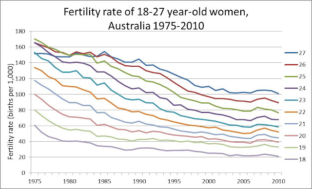
While the rate falls away after 40, with less than 1% of women in Australia giving birth past 42 in 2010, the fertility rate of 35 year olds has doubled since 1989. Moreover, the rate for 40-year-olds has more than tripled in the same period.

I probably shouldn't be surprised when infants completely take over my feed in the coming years.

_________________________

The following three graphs are included in response to questions in the comments section. They are added for completeness.


______________________________
1: Births, Australia, 2010 - http://www.abs.gov.au/ausstats/abs@.nsf/mf/3301.0
2: Friends grouped in 5-year brackets (mostly for confidentiality reasons… and lack of exact age information)
3: Australian Census of Population and Housing, 2011.